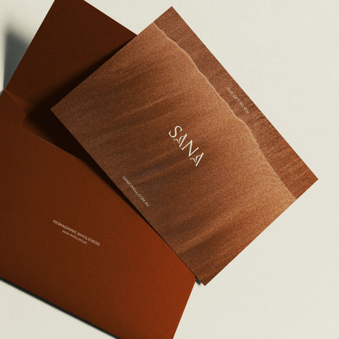
Sana was born from a simple yet powerful belief: true wellness starts from within. It’s not just about what we eat, but how we nourish ourselves—physically, emotionally, mentally, and spiritually. Sana exists as the natural blending of passion and purpose—a space where nutrition meets mindfulness, pairing gut-nourishing blends with simple, grounding rituals.
For over a decade, Paula and Michelle have been connected by the combined belief that gut health is the cornerstone of optimal wellbeing, this philosophy has guided them towards the creation of Sana, a project spanning nearly 18 months and built on the notion that we each deserve to thrive. Matilda Wilson Creative were approached by the founding team during the conceptual stage and tasked with cultivating their vision into a range of tangible products, self-care rituals and a brand experience like none other in the space.

Our Approach
Credits
Illustration: Max McCall
Photography: David Ross
Videography: Matt Grimwood & G Studios
Shoot Styling: Cecilia Bloom
Product Renders: Oliver Chaffe
Copy Writer: Sol Purpose
Photography: David Ross
Videography: Matt Grimwood & G Studios
Shoot Styling: Cecilia Bloom
Product Renders: Oliver Chaffe
Copy Writer: Sol Purpose
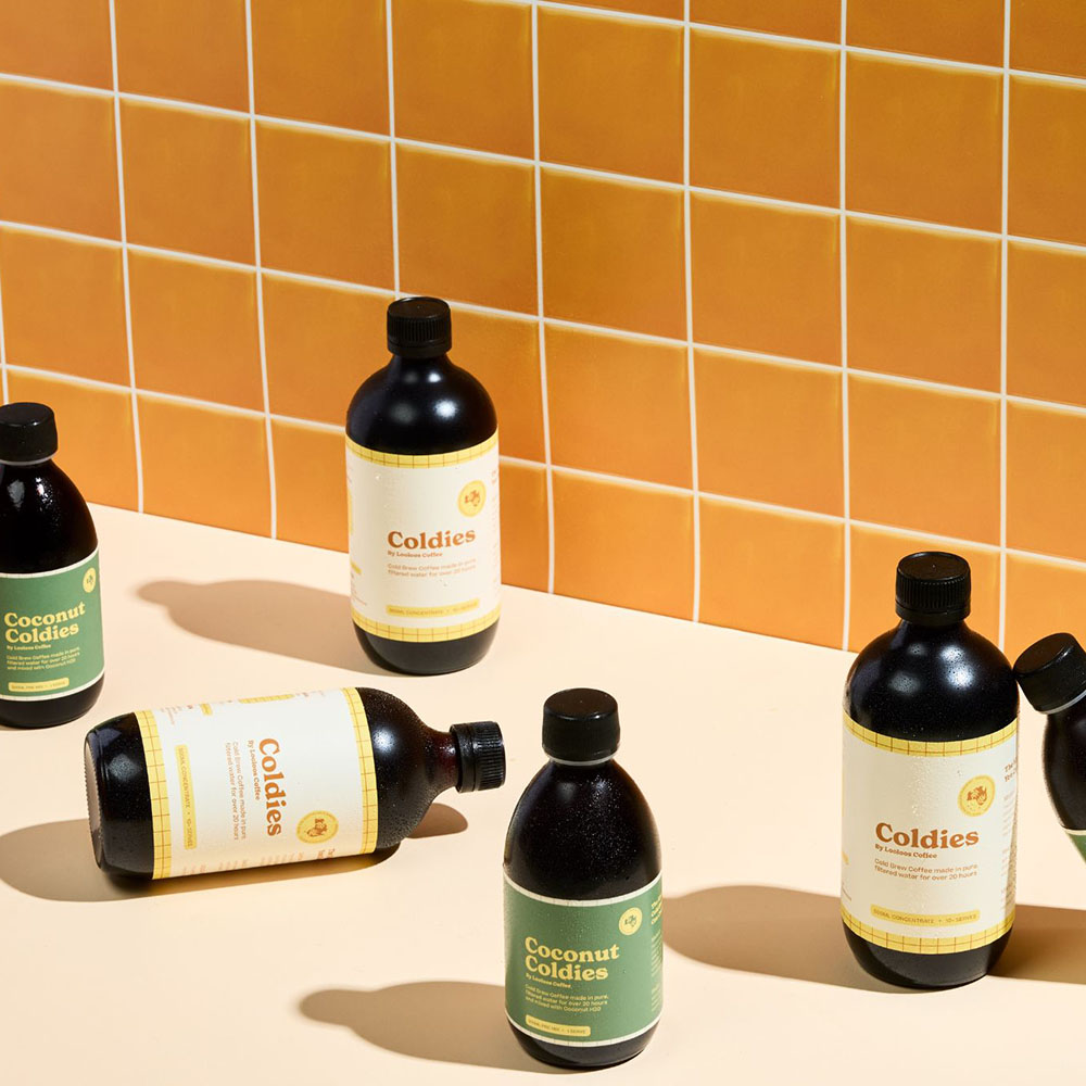
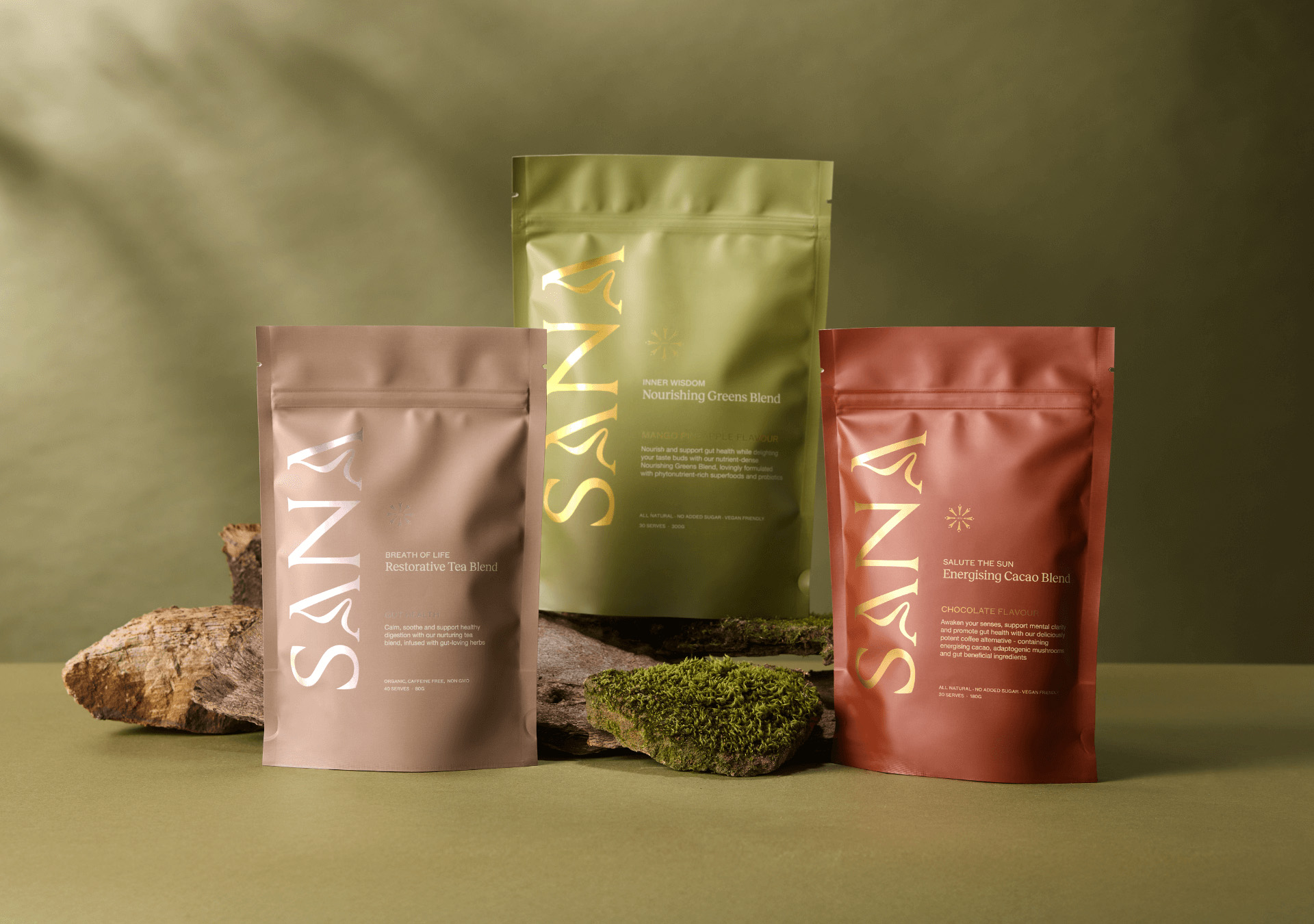
Beginning with strategy, we identified vast issues within the industry surrounding product efficacy, an overload of options and misinformation on what we truly need to enhance our overall health. This, coupled with a team of leading naturopaths brought forth the 4 key blends for Sana in a range of naturally derived flavours. What united our range was the coupling notions of self-care rituals which were thoughtfully paired with each product, the time of day and yogic principles best suited to the products purpose. Further, we utilised colour psychology to future proof our ranges, communicate our natural standpoint and differentiate from the heavily feminine or maximalist brands within the supplementation space. After all, we were offering so much more.
Our Approach
Beginning with strategy, we identified vast issues within the industry surrounding product efficacy, an overload of options and misinformation on what we truly need to enhance our overall health. This, coupled with a team of leading naturopaths brought forth the 4 key blends for Sana in a range of naturally derived flavours. What united our range was the coupling notions of self-care rituals which were thoughtfully paired with each product, the time of day and yogic principles best suited to the products purpose. Further, we utilised colour psychology to future proof our ranges, communicate our natural standpoint and differentiate from the heavily feminine or maximalist brands within the supplementation space. After all, we were offering so much more.
Credits
Illustration: Max McCall
Photography: David Ross
Videography: Matt Grimwood & G Studios
Shoot Styling: Cecilia Bloom
Product Renders: Oliver Chaffe
Copy Writer: Sol Purpose
Photography: David Ross
Videography: Matt Grimwood & G Studios
Shoot Styling: Cecilia Bloom
Product Renders: Oliver Chaffe
Copy Writer: Sol Purpose

In Summary
The identity for Sana, packaging schematic and curated illustrative elements that represented our 8 integrated pillars of wellness were weaved across all communications firstly in print and later within key digital outputs. What was developed involved a range of sample packaging, custom gift boxes, ritual cards, mailer satchels, social media content and digital animations before lastly delving into the e-commerce website with our developer, Jason.
Our site quickly became the nucleus of brand experience for Sana, combining an effective UI strategy to drive traffic with UX awareness speckled throughout, striking the balance between a monetary platform and a place for community and connection. Completely custom built, the internal web team alongside copy writer Sol Purpose and their director Dallas Youles crafted an SEO optimised platform with subscription integrations, extensive customer flows and stunning launch photography that created a digital experience far from the general realms of start-up brands. A big thank you to founders Michelle and Paula for their complete trust in our capabilities as project leads.